|
|
Ten Tips For A Better-Looking Train Layout
Here are 10 tips you can use to improve the appearance of your model railroad: 1. Blacken the insides of tunnels. Use flat black on all interior surfaces - walls, ceiling and floor. There's nothing worse than a beautiful layout with a plywood-colored tunnel interior. Tunnels should be dark and mysterious. If you're using Styrofoam for your mountain, most black paints will attack the foam. Substitute the darkest brown, water-based, acrylic latex paint you can find.
3. Make grade crossings look real. Use thin black foam, black painted balsa wood, plastic strips (or even tongue depressors - 'painted' with a black Sharpie marker) as inserts to cover the railroad ties at road crossings - giving the crossing a more authentic look. 4. Put operating signals at crossings. Use either a set of crossing flashers or a flasher and drop-arm combo. MTH makes durable, realistic ones. Kids are mesmerized by these 'lights and action' items. 5. Buy tunnel portals. They look much more realistic at a tunnel entrance than a rough cut hole. I bought mine from Scenic Express (the company offers a good selection of portals), then I 'weathered' them with gray-wash, chalk, etc. 6. Make your road vehicles look real. I black-wash the grilles and hubcaps of model cars and trucks to add depth and realism. I also paint taillights, parking lights and door handles if needed with a small brush. Then I take the cars apart and install drivers and passengers. Nothing looks sillier on a layout than vehicles seemingly driven by invisible ghosts!
I use 1:48 scale injection molded sitting figures made by Circus Craft. (I purchased mine from York Trains.) The figures come in male, female and child variations and are molded in 'flesh' color. The arms must be attached by gluing, then the figures can be painted. Sometimes, the figures won't fit between the steering wheel and the seat. When that happens, I simply cut the legs off with a pliers and they fit just fine. Use flat (rather than glossy) model paint to make painted clothing and hair look real. Here's a bonus tip from my personal experience - don't try to paint neckties on the little men after drinking multiple glasses of Merlot.
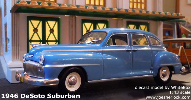
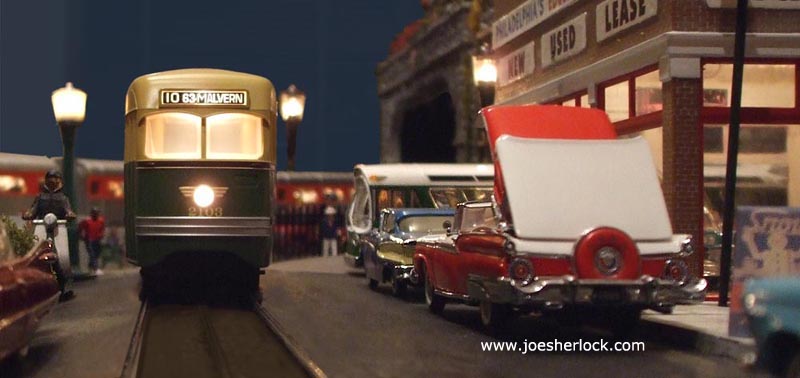
Numerous manufacturers offer 1:48 scale "people" - MTH, Model Power, Preiser, Arttista and many more. Buy a some from each supplier to add variety to your layout. I attach my people to the layout using Amazing Goop. 8. Make plastic buildings look real. First, paint exterior surfaces with a mixture of hobby paint (flat white, flat gray or flat black) and hobby thinner. Let sit for ten minutes then wipe off. This removes some of the gloss from the plastic and will "color in" any depressions or marks, bringing out tiles, shingles, siding and bricks. White paint applied and wiped off will "mortar" the red brick walls of buildings. You an also apply mortar by rubbing the surface vigorously with white chalk, brushing lightly and sealing the chalk dust with matte fixative or clear hairspray. (Don't forget to do all this solvent stuff in a well-ventilated space or you will get woozy. Or drunk. Or dead.) Some plastic buildings look opaque but become translucent when internally lit. Since you want light to shine through the windows, not the walls, cut aluminum foil into properly-sized panels and glue to the interior walls using an ordinary glue stick or Amazing Goop. You can do the same for plastic roofs, too. I sometimes create frosted windows using onion-skin paper glued in place. You can also draw curtains or blinds on the onion skin for added detail. The above photo of a model 1946 DeSoto was taken in front of the Union Station on my model train layout. The cheap-and-cheerful $12 white and green Plasticville snap-together building looks very nice when detailed with gold and cememt gray paint and glazed with translucent onion-skin paper on the windows and doors. Make your street scenes come to life with a mixture of cars, people, detailed buildings and signs:
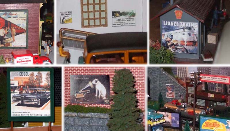
9. Make cool advertising. Scan old magazine ads and re-size them with a graphics program to create one-of-a-kind, realistic billboards and signage. Most real world scenes, especially in cities, have signs everywhere. Use lots of ads and signs of all kinds and sizes to add realism to your layout:
I also recommend the use of eye-catching animated neon signs from Lightworks USA. 10. Be true to your theme. Don't mix eras - putting 1970s billboards in a turn-of-the-century Western theme. Or putting a Lexus SUV in a fifties-era scene.
PS - I have no ties to any of the companies I've recommended here and have received no compensation from them. I'm simply a customer who has been pleased with service I've received. All of the companies listed here have websites - you can find them using Google or any good search engine.
I hope this information is helpful.
|
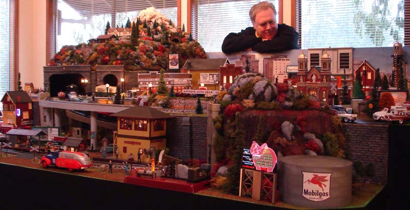
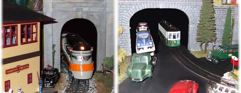
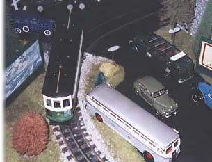 2. Use darker colored ballast in middle of your track. This will help de-emphasize the O-gauge middle third trail (if the rail is black). Most real railroads have ballast which is naturally darkened in the center of the track - from oil drippings. Use darker ballast around tunnel entrances, too.
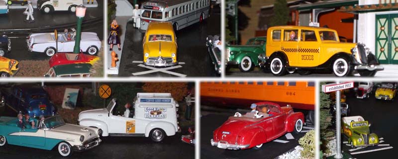
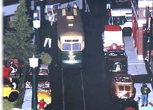 7. Add more people. You can never have too many people on your layout. Put them everywhere - on streets, station platforms, walking out of businesses, etc.